Rebrandt- Engaging Content Experiences
Usability Audit & Post Launch Enhancements
Responsibilities: Research, UX Design, UI Design, Information Architecture, Wireframing
Team: Grace Tran & Tamir Said- Ahmed
Duration: 90 hours/ 6 weeks
Platform: Desktop
Tools: Miro, Figma, Zoom
-
2 Menu Variations to test
-
Dashboard variations
-
Updated Design System
Solution
-
No user base to test usability issues
-
Dashboard not intuitive
-
Strict stakeholder guidelines to follow
Problem
-
Updated Dashboard
-
Live Menu
-
Updated Design System
Outcome
Define The Scope Of Work
Usability Audit
1
Cosmetic Problem Only: Need not be fixed unless extra is available on this project
2
Minor Usability Problem: Fixing this should be given low priority
3
Major Usability Problem: important to fix, so should be given high priority
4
Usability Catastrophe: Imperative to fix this before product can be released

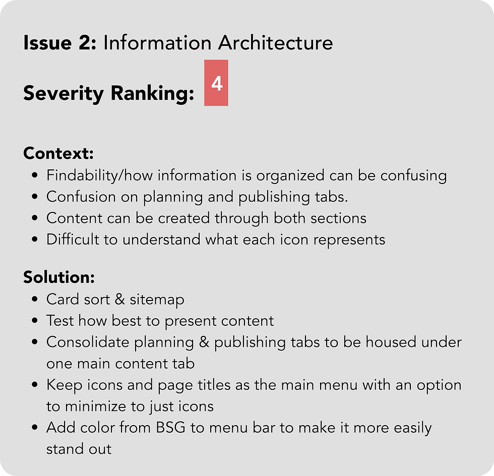

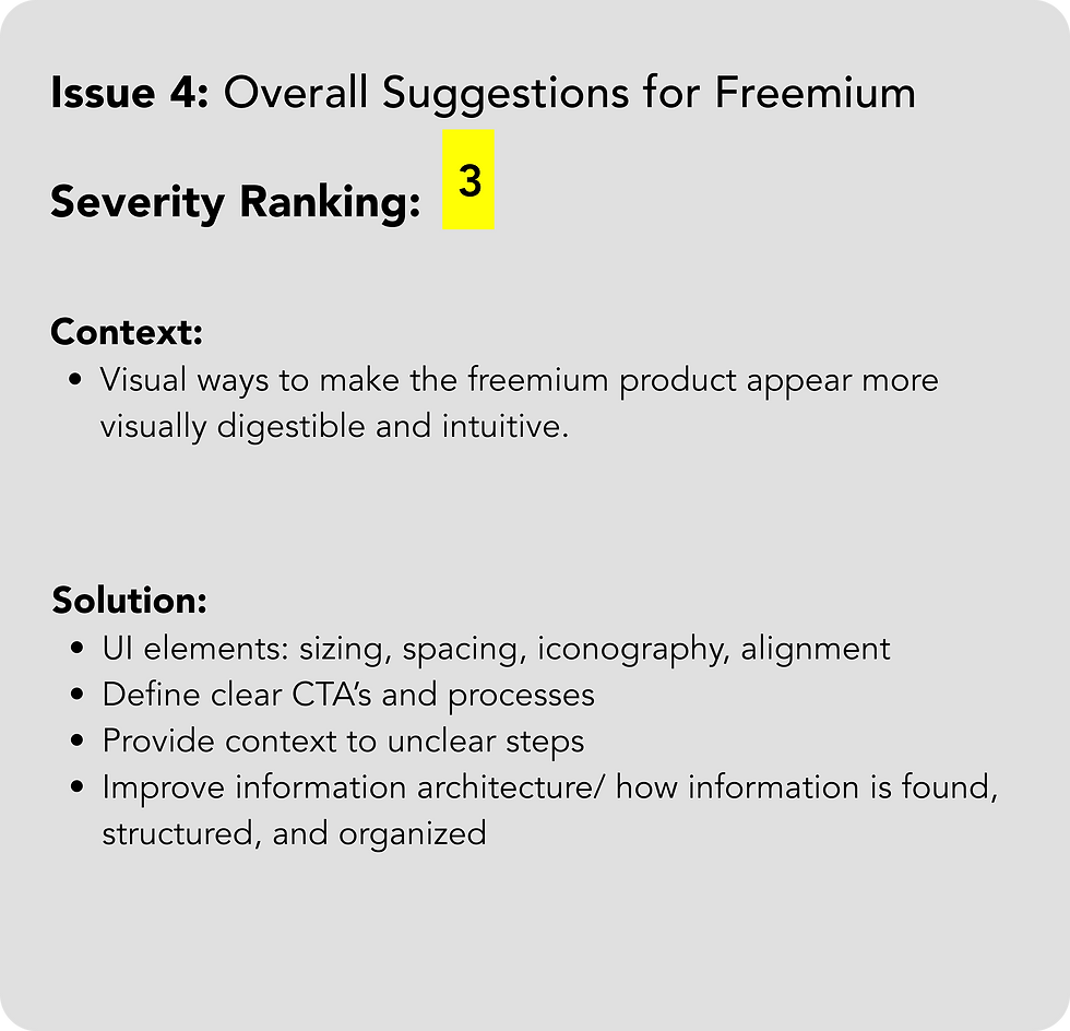


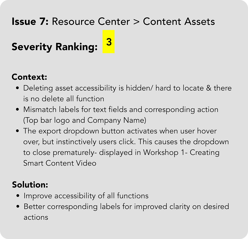

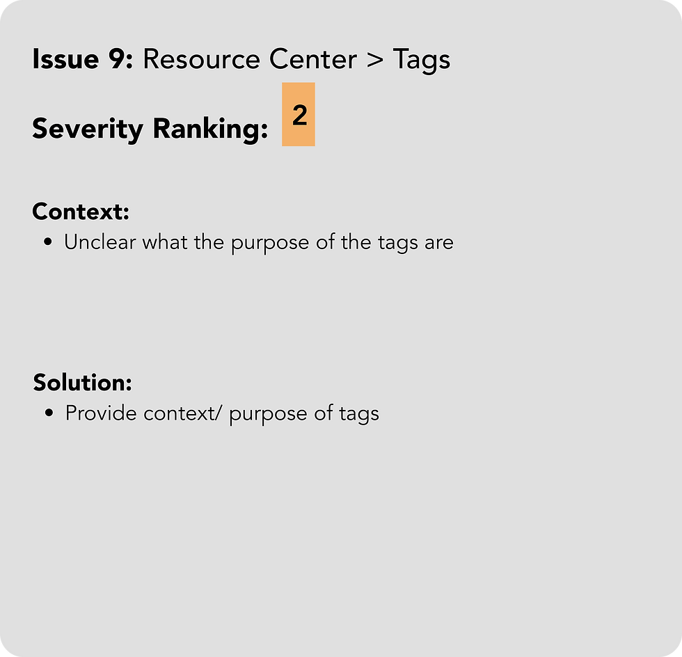


Stakeholder Meeting
In our meeting with stakeholders, I presented our findings. After discussing their main area of focus, we reached an agreement on the design team's scope of work
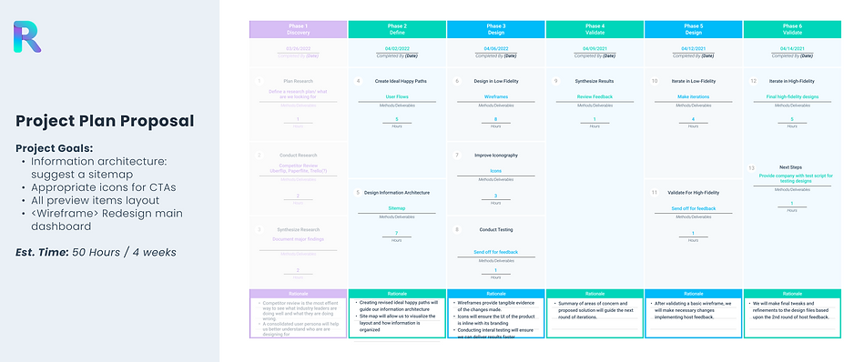
Project Plan
In order to maintain our projected timeline, we presented a project plan to the stakeholders. This allowed for clear communication and project expectations.
-
Audit
-
Competitive Analysis
Research
-
User Flows
-
Sitemap
-
Lo FI Wireframes
-
Design System
Ideate
-
High Fidelity Wireframes
-
Send Off
-
Iterations
Design
-
Hand Off
-
Iterations
-
Testing Script
-
Data Analysis
Validate
Research
Competitive Analysis
Upon exploring the Rebrandt platform, I conducted a comprehensive competitive analysis. I delved into user reviews, software features, and visual layout.


User Reviews
"We underestimated the amount of time a launch would take and I do not recommend rushing this process."
Usability Notes
-
Long set up process
-
Learning curve for non technical users


User Reviews
"The platform has a lot of features that can take time to learn."
Usability Notes
-
Long learning curve for new users
-
Expanded and minimized side menu
Ideate
User Flow
To grasp the platform's intricacies, I outlined the user flow for each key feature, gaining insights into its nuances and focus during the design process.
Key Processes:
-
Create an Idea
-
Content in Production
-
Create a Campaign
-
Create Smart Content
Sitemap: 2 Versions
The design team decided to present 2 Menu variations. One is more similar to the original and the other is more abstract. We wanted 2 versions to be able to test them.
Original Menu
Version 1
Version 2

-
V1 & V2 replaced Planning tab with Dashboard
-
V1 & V2 added calendar tabs
V1
-
Publish tab replaced Content tab
-
Resource Center tab removed and sub headings dispersed elsewhere
V2
-
Strategy tab replaced with Create
-
Publish tab removed
Original Menu
Version 1
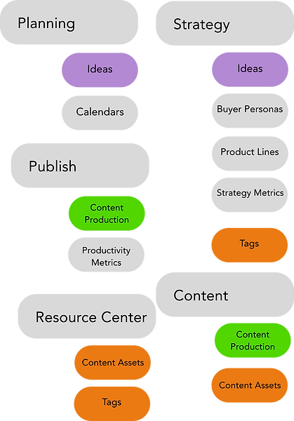
V1
-
Planning heading removed
-
Ideas moved under Strategy
-
-
Calendar given main heading
-
Publish heading removed
-
Content Production moved under new Content tab
-
-
Resource Center heading removed
-
Content Assets moved under Content tab
-
Tags moved under Strategy
-
Original Menu
Version 2
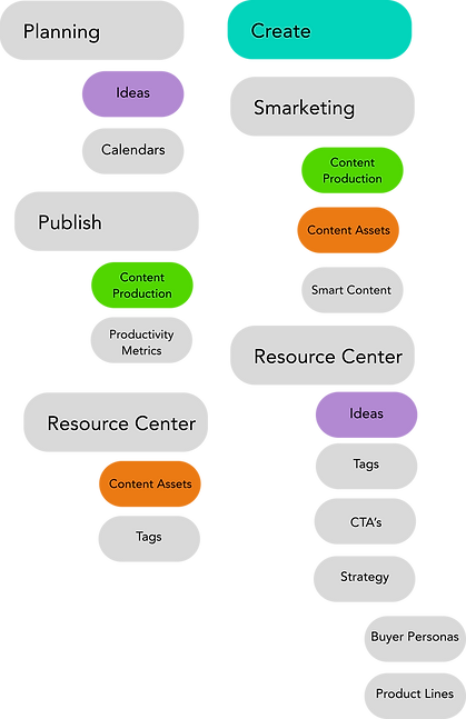
V2
-
Planning heading removed and the Create heading added
-
Ideas moved to the Resource Center
-
Calendars given own heading
-
-
Publish heading removed
-
-
Content Production moved to Smarketing
-
Content Assets moved to Smarketing as well
-
Lo Fi Wireframes
The design team brainstormed individually and collectively and decided on the following:
-
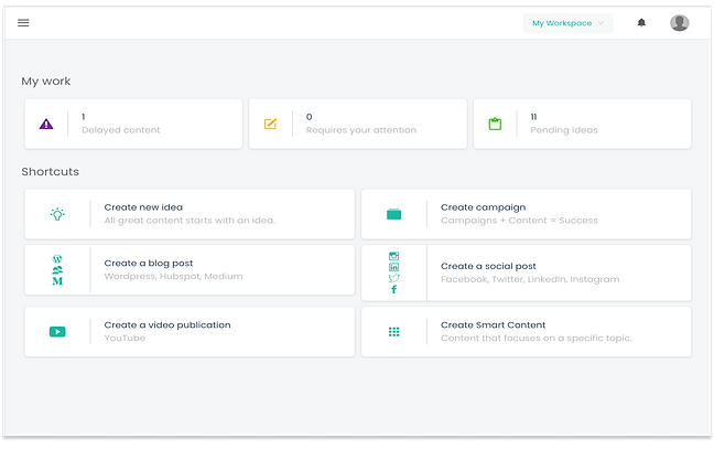
Remove shortcuts title and change label to Create with minimized text for the boxes below
-
Replace Workspace CTA in the header with the Create CTA
-
Feature Calendar Events
-
Changed iconography to more intuitive icons
-
Incorporated the branded rocket icon per Stakeholder's request
Before
After

Design System
The design team brainstormed individually and collectively and decided on the following:
-
Remove shortcuts title and change label to Create with minimized text for the boxes below
-
Replace Workspace CTA in the header with the Create CTA
-
Feature Calendar Events
-
Changed iconography to more intuitive icons
-
Incorporated the branded rocket icon per Stakeholder's request
Before
After


Design
High Fidelity Designs:
Dashboard
-
Remove shortcuts title and change label to Create with minimized text for the boxes below
-
Replace Workspace CTA in the header with the Create CTA
-
Feature Calendar Events
-
Changed iconography to more intuitive icons
-
Incorporated the branded rocket icon per Stakeholder's request

Main Components

Notifications

Productivity Metrics
Header & Menu
-
We replaced the 'Workspace' section in the header with the 'Create' dropdown button for users to easily access on any page
-
'Workspace' button moved to the right under the user profile


Key Pages
-
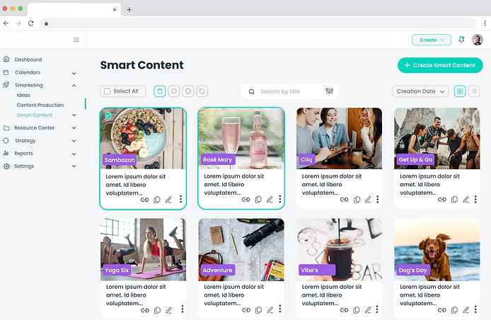
While auditing the website, I found inconsistent main navigation pages. To improve user experience and eliminate confusion the design team worked to simplify key processes. I foucsed on enhancing the Smart Content page while my colleagues redesigned other important pages.
Smart Content
List View & Grid View
Original


Validate
Dashboard Iterations
-
Replaced the calendar view with user's productivity metrics
-
3 Productivity Measurement categories: Completed, In Progress, and Not Started
-
Categorized by Quarter
-
-
Changed create section to one solid color. With the inclusion of the productivity metrics there woul be too many colors being used without real intent.

Menu & Header Iterations
-
The stakeholders asked to move the workspace settings from the header to the menu because they have some users with up to 40 workspaces.

-
They preferred to remove the side menu in the workspace section and rather have the workspace menu drop down into the main menu.
-
When workspace menu activated settings icon changes to green.


Key Pages Iterations
-
I met with stakeholders who emphasized the need for a preview image, so I included it in the final design.
-
They requested that we keep the link, duplicate, and edit icons as the most important ones, while the rest are shown in a dropdown menu.
-
Additionally, social icons were added back based on stakeholder feedback.
-
In the grid view, we opted for one solid color for tags to prevent confusion caused by repeating colors due to limited brand colors for each content type. When a card is selected for multi-select options, it is highlighted using brand colors. Furthermore, we incorporated three dots that open a dropdown menu with edit options.

Ideas Page
For the Ideas page redesign my colleague Tamir handled the design. His goal was to make better use of the space and consolidate the information presented to users.
Content in Production Page
For the Ideas page redesign my colleague Tamir handled the design. His goal was to make better use of the space and consolidate the information presented to users.
Results
1. The final dashboard the design team and stakeholders collaborated on is now live on the platform for users to utilize.
Rebrandt has 3 varaitions for future user testing.
2. The updated menu is now live for users on the platform.
Rebrandt has 2 menu versions to test and guide future iterations.
3. Consistency created on the product.
-
Redesigned 3 key pages to follow the same process design.
-
Delivered icon library that has since been added to the brand style guide


Next Steps: User Test & Iterate
-
The startup now has 2 original sitemaps to test on users and guide any iterations to the menu.
-
The design team presented 3 dashboard variations on what we felt were the most important features to users. Repurpost now has those 3 versions to test on users and help them iterate on the dashboard.
-
The design team also provided a test script, and guide on tracking testing metrics.
What I Learned
While working on this project I was given the opportunity to take on the challenge of redesigning a complex platform's information architecture. I learned how to think fast and pivot ideas as I collaborated with the team. I also learned how crucial it is to maintain consistency for users. While we were redesigning the platform we had to be cautious of making too many large changes to the design which might confuse current users.

